
This is the first of hopefully many blogs. My goal is to always write something new. Something you never thought of or something you didn’t know. You may not agree with everything I have to say, and that’s perfectly fine. I encourage you to keep an open mind though, so we can evolve together. The greatest development comes when you move outside of your comfort zone.
Artists can be divided into two groups – interpreters and creators. One is not better than the other. They are just different. Interpreters could be singers or actors as they interpret the work of others. Creators are singers, screenplay writers or anyone that creates their own work.
I think sports writing and blogging is much the same way. There’s plenty of people out there with superior writing and interpretation skills to me, but I do have the ability to think outside the box and create my own work.
This first series of blogs will be about statistics. How to describe and predict results, knowing full well that hockey is a complex sport, that can’t be completely explained using stats. The unpredictability is part of the beauty of the sport. The goal is to give you my take on current statistics and come up with new tools to better evaluate performances and project future outcomes.
Before we get started, I have to apologize in advance for my bad writing. It’s in part because English is not my first language, but honestly I’m just not as good a writer as I would like to be.
With the introduction out of the way, let’s get started. This very first blog will be about my take and interpretation of current statistics. So this one won’t be as “out of box” thinking as the upcoming blogs.
I will try and write it in a manor, so that most people understand it and can follow my line of thoughts.
My approach is to look for trends and correlations over a very large sample size – every game from 2007/2008 to 2019/2020.
It’s difficult to evaluate advanced statistics on an individual player level, because you have to use on-ice stats which depends on 11 other players as well. Besides that, there’s no agreed upon metric to measure the quality of a player. We can all agree, that McDavid is a better player than Matt Martin, but is he also better than Auston Matthews. Most think he is, but it’s really a matter of opinion. There’s no way to conclude one way or the other. It will always be a subjective opinion.
It’s quite different, when we’re evaluating the performance of a team. Good teams win hockey games and outscore their opponents. This is the agreed upon measurement for team performance. Of course good teams can lose in the short term, but if they keep on losing, then they are really not a good team. It’s as simple as that.
This is why I evaluate stats at the team level. Then you can compare the statistics to team performance, and see how well they correlate. I have decided to use GF% as my measurement for team quality. If you outscore your opponents you’re a good team.
First I’m looking at the correlation between corsi (total shot attempts) and GF%. I’m using all strengths data, because hockey isn’t just played 5 on 5. On the individual player level, you have to use 5v5 data, because players have different roles, but on the team level it makes sense to look at all strengths.
Here’s the graph with GF% (y-axis) plotted as a function of CF% (x-axis). Every dot represents a season of a team. There’s a total of 393 data points – 10 seasons with 30 teams and 3 seasons with 31 teams.

Clearly there’s some correlation (R-sqaured = 0.2736) between corsi and winning, but it’s not nearly as big as you would think based on some writer’s almost religious usage of corsi.
Corsi is simply the number of shot attempts, so it seems intuitively right that corsi leads to shots which leads to goals. But it also seems intuitively obvious that you would have to factor in the quality of the chances, the goaltending and quality of your shooters. The graph shows that you can’t ignore these other factors.
Now let us turn our attention towards expected goals. Before we get started, it’s important to now that xG-models differs depending on which source you’re using (I’m using evolving-hockey.com in this example). Basically these xG-models try to combine quantity and quality of chances. Expected goals depends on shot placement (distance and angle), shot type (slap shot, wrist shot etc.), if it’s a rebound and if it’s a first timer. Breakaways, odd man rushes and cross ice passing are not accounted for in xG-models.
In other words, xG-models are not perfect, but at least they try to account for the quality of the chances. Therefore, you would expect there to be a greater correlation with goal differential, and this is exactly what the following graph shows.

As mentioned, expected goals correlates better (R-squared = 0.4771) with GF% than corsi does. This sounds about right, as we’re now factoring in the quality of each shot attempt. It’s important to note that goaltending and shooting ability is still not factored in. This means, you can interpret xG as the expected number of goals with average goaltending and average shooting. So if your team has an elite goaltender or elite shooters (like Ovechkin and Laine) you should expect GF% to be higher than xGF%.
The next metric I would like to discuss is PDO, and it is simply the sum of shooting% and save%. You often hear people call PDO a measurement of luck, which is crazy if you ask me. For PDO to measure luck it would have to revert to 100 over time (spoiler alert: It doesn’t). This means that some teams have a natural PDO above or below 100.
Here’s an analogy:
If you flip a coin 10 times you can beat the probability and flip 7 heads, thus being “lucky”. If you flip a coin a million times it will always end up at 50%.
If you however paint one side of the coin, thus making it heavier and therefore more likely, then the probability of heads is maybe 55%. If you only flip the coin 10 times or even a hundred times, tails can still beat the odds, but with a big enough sample size the outcome will always be 55% heads.
It’s the same with PDO. Over time it will always revert to the natural PDO, so if you can estimate the natural PDO, you can use PDO to determine if the current results are sustainable.
I believe natural PDO depends on 3 things:
- Team strategy – If you value quality over quantity (think Trotz style hockey)
- Goaltending – A good goaltender leads to a higher save percentage
- Shooting – Good shooters and shot distribution matters. You want your best shooters to take as many shots as possible.
Anyway, here’s the graph of PDO
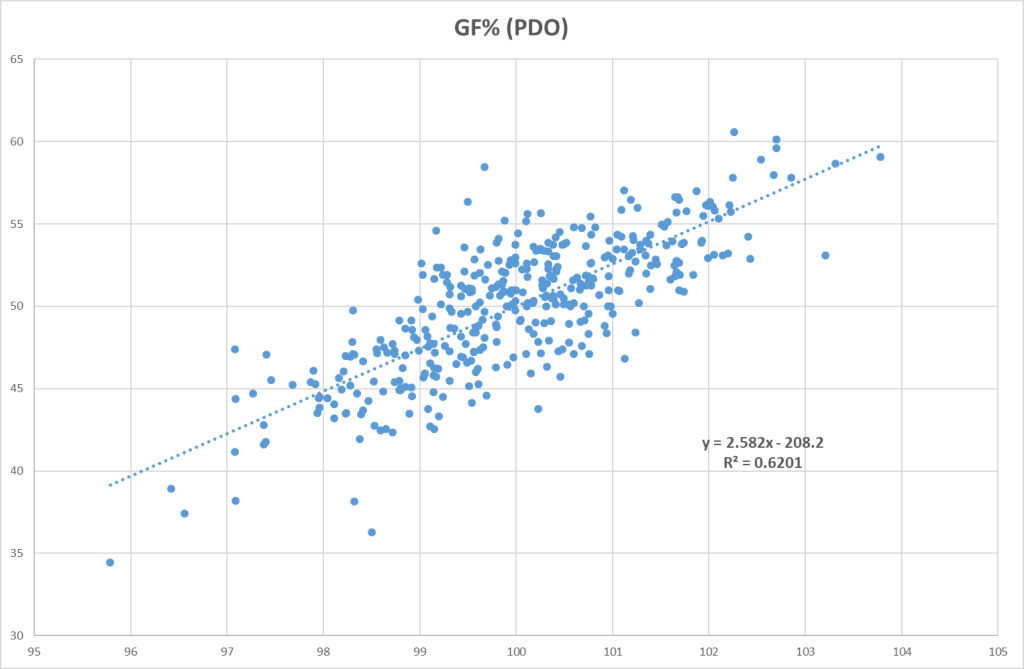
The graph shows that PDO correlates better with goal differential than xG and corsi. The problem with PDO however, is that it’s difficult to predict and it depends on different factors (see above). Therefore, I think it makes more sense to try and interpret shot quantity, shot quality, goaltending and shooting separately.
I have also made a graph combining corsi and dPDO (PDO minus 100). Now we see a great correlation with goal differential.
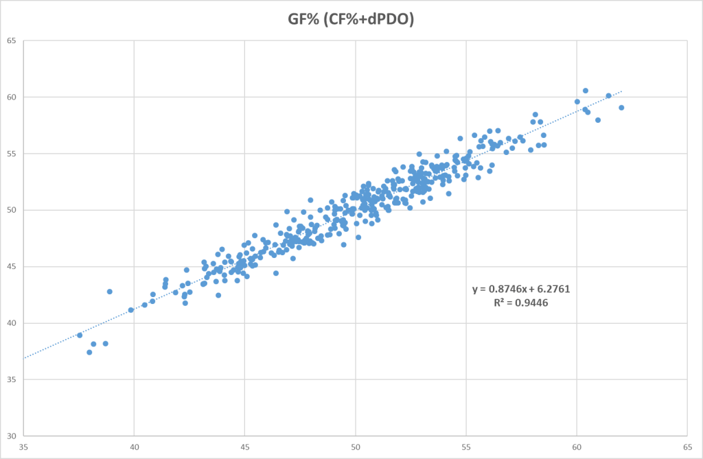
If we combine shots and dPDO, we will actually get a perfect correlation.

There’s absolutely nothing revolutionary about this finding though, as this is simply how you can define goal differential: G+/- = S+/- * dPDO
My point with this exercise, was to show that you can describe results using a combination of corsi and PDO, but what’s the point. You want stats/models that can describe the past, but at the same time tell you something about the future. To put it another way, you want stats that are both descriptive and predictive.
The final thing I want to talk about in this blog is how to measure goaltending and shooting ability. Clearly, the traditional way is to use Sh% and Sv%, but I think it’s preferable to factor in xG-models, so we also account for the quality of the chances.
People are starting to use goals saved above expected (GSAx) instead of GSAA or Sv% to describe goaltender performance. There’s quite a big difference between using GSAx and GSAA (especially in some cases). The reasoning for using GSAx, is that you want to factor out team defense as much as possible.
Evolving-hockey.com uses dFSv%, which is just GSAx per fenwick (unblocked shot attempt). They use fenwick instead of shots, because a good goaltender can force the shooter to miss the shot more often than a bad goaltender can. At least that’s the theory.
You can do the same thing for shooters using individual goals and expected goals: dFSh% = (iG-ixG)/iF
The positive thing about using dFSh% is that you can compare players directly. It doesn’t matter if you’re a defender or a forward, if you play 5v5 or on the PP. Conventional shooting percentage depends heavily on role, style of play and position. The only problem with dFSh% is, there’s no where you can find this stat directly, so you will have to calculate it yourself.
The next blog in this series will hopefully be a bit more revolutionary. There I will look at current GAR models and use them to make my own metric.
Conclusion:
- Be aware not to overvalue corsi or even xGoals. These stats never tell the whole story, which is why they don’t correlate all that well with winning.
- PDO does not measure luck. If you can estimate the natural PDO, then you can use PDO as measurement for sustainability.
- xG-models are not perfect, but they are currently the best we have, because they combine quality and quantity.
Stay safe and remember to be kind.
All stats from evolving-hockey.com
