Currently, I’m working on re-building my database and models. In this series I will take you through the process. The aim is to be as transparent and precise as possible. I will share all my code and all my files for everyone to use. Hopefully, this can be helpful in getting more people into hockey and hockey analytics.
I like to think that one of my biggest strengths is my ability to explain complex matters in an easy-to-understand manner. The goal is to write a series which everyone can follow – Even without any pre-coding experience.
Previous articles in the Series:
- Getting data directly from the NHL Api
- Cleaning and Transforming NHL data in MySQL
- Building xG Models in Python
Looking at shooting percentages in General
Let’s start this article by simply looking at 5v5 shooting percentages across the ice. We’re using fenwick shooting percentage (FSh%), because the primay xG model is based fenwick (all unblocked shot attempts).
Below is the heatmap of FSh% at 5v5:
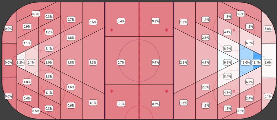
This shows the actual shooting percentages and illustrates quite well why xG is important. Not all shots are equal. Shots close to the net have a significantly higher probability of becoming goals.
There are a few important things to note here:
- There are some surprisingly high shooting percentages from the defensive end. This is a clear indication that some shots are tracked on the wrong side of the ice. It’s difficult to fix this problem, because there are also many actual shot attempts from the defensive end. The mistakes are relatively few, but they’re still something to be aware of.
- Shots from behind the net seem to have an unrealistically high goal probability. The problem with behind-the-net shots is that they don’t become shots unless they hit the net. If a shot or a pass from behind the net gets deflected on net, then and only then is it counted as a shot. This leads to an undercount of shot attempts from behind the net which creates the inflated shooting percentages.
Below is the heatmap of FSh% at 5v5 from 2009/2010 to 2011/2012:
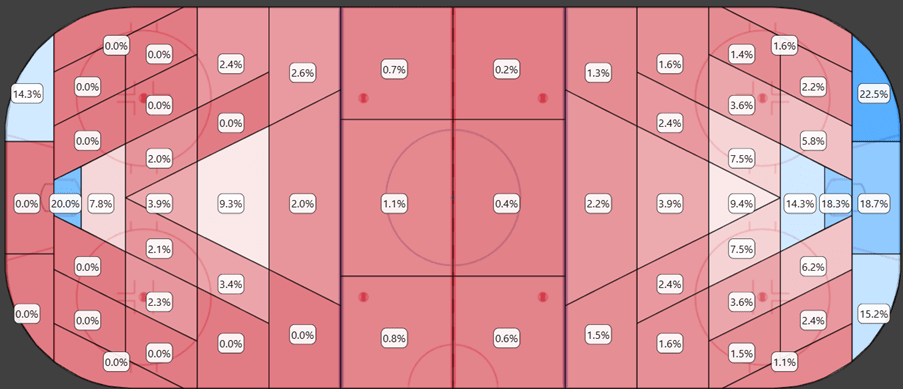
This is just to illustrate that these problems are mostly a thing of the past. It was much more problematic in the early seasons. Maybe we shouldn’t have built the xG models based on the entire dataset, but should have limited the model to the newer/better data.
Below is the heatmap of FSh% at 5v5 from 2022/2023 to 2024/2025:
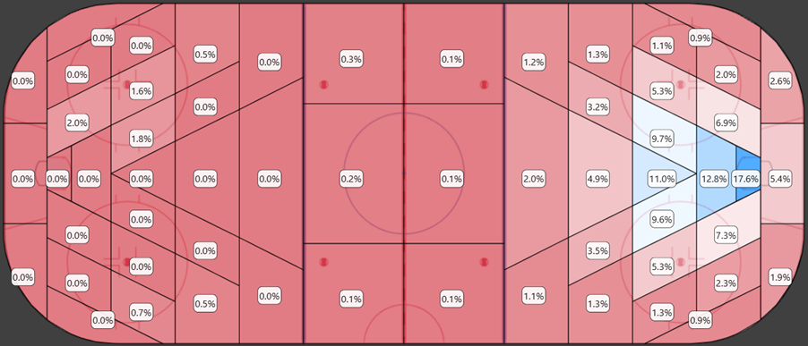
In the last 3 seasons we see a heatmap that is much better aligned with our expectations. In the last 3 years they have started counting many more shots from behind the net.
In the next section we will focus solely on offensive zone shots.
Lefthanded shots vs. Righthanded shots:
Let’s start by comparing left-handed shooters to right-handed shooters. This is a pretty clear map. Left-handed shooters have the higher shooting percentage from the right side of the ice, and it’s the opposite from the left side of the ice. I think this intuitively makes sense, as they can shot onetimers off of diagonal passes and generally have a better shooting angle due to the handedness.
This is probably something we should include in a future xG model.

Defenders vs. Forwards:
The next map shows the defenders vs. the forwards. ‘Red’ is where the forwards have the higher shooting percentage and ‘blue’ is where the defenders have the higher shooting percentage.
The trend is a little messier here, but generally you can say that forwards are better finisher from very close range.

Home vs. Away:
Next, we will compare home team shots to away team shots. We do see a trend where the home team shots from close range have a lower goal probability. I doubt this has anything to do with the finishing being worse at home, but it could be an indication of a slight home bias.
If home team shots are tracked slightly closer to the net, then we would expect to see something like this.
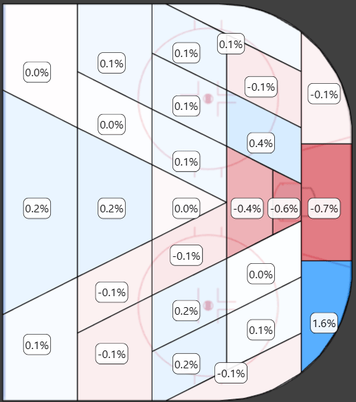
FSh% vs xFSh% (dFSh%):
Finally, we will compare the actual shooting percentage (FSh%) with the expected shooting percentage (xFSh%). This difference is typically called delta fenwick shooting percentage (dFSh%). We can use this comparison to evaluate the xG model.
When the heatmap is ‘blue’ it means that the actual shooting percentage is higher than the expected shooting percentage. There are some important things to note here:
- Shots from very close range have a significantly higher shooting percentage than expected from the model.
- Shots from behind-the-net have a significantly higher shooting percentage than expected.
- Shots from bad angles have a lower shooting percentage than expected.
The current xG models use shot distance and shot angle as input variables, but this approach is clearly not working perfectly. The better approach is probably to split the ice into zones and then use the zones as categorical input variables. Some things can’t simply be explained using distance and angle.

Descriptive Testing
Now we will turn our attention to the testing of the models. We will split the testing into two categories:
- Descriptive testing: How well does the model explain/describe past events?
- Predictive testing: How well does the model predict future events?
Test data and Training data:
When we built the xG models in the previous article, we split the data into a training set and a testing set. The training sets were used to train the models (70%) and the testing sets can now be used to test the models (30%).
This means that the test data is independent of the model building process. In the following test we will only use the test data (unless it specifically says otherwise).
Log loss and Area Under the Curve (AUC):
Typically, you will use log loss and AUC to evaluate the descriptive power of a logistic regression model. Log loss and AUC tell us something about how well the xG models describe goals.
Log loss:
Here’s the AI (Copilot) explanation of log loss:
Log loss—also known as logistic loss or cross-entropy loss—is a performance metric used to evaluate the accuracy of a classification model that outputs probabilities.
In simple terms, it measures how far off the predicted probabilities are from the actual labels. The lower the log loss, the better the model’s predictions.
🧮 How it works (for binary classification):
If the true label is ( y \in {0, 1} ) and the predicted probability of the positive class is ( p ), then the log loss for a single prediction is:
[ \text{Log Loss} = -[y \cdot \log(p) + (1 – y) \cdot \log(1 – p)] ]
This formula penalizes confident but wrong predictions more heavily than less confident ones. For example:
- Predicting 0.99 when the true label is 1 → low loss ✅
- Predicting 0.01 when the true label is 1 → high loss ❌
📌 Why it matters:
- It’s widely used in logistic regression and neural networks.
- It gives a nuanced view of model performance beyond just accuracy, especially when dealing with imbalanced datasets.
The formula in this explanation is a little confusing, but it’s basically just:
Log loss = -ln(1 – error)
In our case, the error is the absolute value of xG – Goal:
Log loss = -ln(1 – ABS(xG-Goal))
So, if a shot has a 0.035 value according to the xG model, and it’s not a goal, then the log loss will be:
Log loss = -ln(1 – ABS(0.035-0)) = 0.0356
When you calculate the log loss of a model, then you take average log loss of every event (or shot in our case). The lower the average log loss the better the model.
The tables below show the log loss at different strength states for the two xG models:
- Logloss_F is the log loss for the Fenwick based xG model.
- Logloss_S is the log loss for the Shot-on-Net based xG model.

The fenwick based model will naturally have a lower/better log loss. It includes shot misses, which by definition can’t become goals, so the average prediction will be better. If we build a corsi based xG model (including shot blocks), then the log loss would be even lower.
ENA stands for “Empty net Against”, so it’s shots against an empty net. I’ve excluded the ENA state in the Shot based model, because all shots on net against an empty net by definition will be goals… So, the xG value of all ENA shots in the shot based model is simply set to 1.
AUC:
Here’s the AI (Copilot) explanation of AUC:
Area Under the Curve (AUC) is a metric used to evaluate the performance of classification models, especially in binary classification tasks. It’s most commonly associated with the Receiver Operating Characteristic (ROC) curve, which plots the true positive rate (sensitivity) against the false positive rate (1 – specificity) at various threshold settings.
📈 What does AUC represent?
AUC measures the entire two-dimensional area underneath the ROC curve—hence the name. It tells you how well your model can distinguish between classes:
- AUC = 1.0 → perfect classifier
- AUC = 0.5 → no better than random guessing
- AUC < 0.5 → worse than random (your model might be flipping the labels!)
🧠 Why it’s useful:
- It’s threshold-independent, meaning it evaluates model performance across all classification thresholds.
- It’s especially helpful when dealing with imbalanced datasets, where accuracy can be misleading.
🔍 A quick intuition:
Imagine randomly picking one positive and one negative example. AUC is the probability that your model ranks the positive example higher than the negative one.
ROC Curve for all strengths – Fenwick based model:
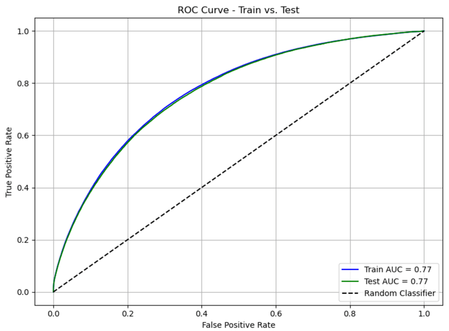
ROC Curve for all strengths – Shot based model:

ROC Curve for 5v5 – Fenwick based model:

ROC Curve for 5v5 – Shot based model:

Goals scored and saved above Expected:
In this section we will look at the evidence from a more anecdotal perspective. We will use the entire dataset (test + train) for this analysis.
Expected goals can be used to evaluate goaltending and finishing – by simply comparing goals scored/allowed to expected goals scored/allowed. This gives us two simple metrics:
Goals Scored Above Expected (GAx) = Goals – xGoals
Goals Saved Above Expected (GSAx) = xGoals Against – Goals Against
The table below show the leaguewide regular season GSAx over the years. This is using the fenwick based xG model (empty net shots and penalty shots are excluded):

We generally see that the xG model underestimates the number of goals. It’s not a huge problem, since we’re talking about -700 goals on a total of 103,000 goals… But it’s still something to be aware of, when evaluating shooting and goaltending.
The two tables below show the best regular season goaltenders and finishers based on GSAx (shot based model) and GAx (fenwick based model) respectively (data from 2009 to 2025):

I think these lists fit the eye-test quite well. I know the entire Montreal fan base disagrees with the Carey Price ranking. According to the model he was really, really bad in 2017/2018 season (around -29 GSAx). Without that season he ranks about Henrik Lundquist – Both of whom are missing some early seasons in the data.
This is a pretty simple xG model, so don’t get too upset about the results.
Predictive Testing
In the next section, we will try to analyze how predictive the fenwick based xG model is of future goals. For this analysis I’m only looking at 5v5 data, and I’m still only using the test data, so none of the data in this analysis has been used to train the model.
The test setup:
In this test we want to use team data. We want to run 3 tests:
- How well does fenwick for, xG for and goals for predict goals for?
- How well does fenwick against, xG against and goals against predict goals against?
- How well does fenwick+/-, xG+/- and goals+/- predict goals+/-?
We will simply take a random test-set and then compare the team level fenwick, xG and goals with the team level goals of the non-test-set (the result data). For every test-size we’re doing a thousand runs… So, it’s actually a thousand random test-sets used in the analysis.
This process is repeated for different test-sizes: 5%, 10%, 15%,… ,95%.
This is all being done in MySQL using a Stored Procedure (function in MySQL). You can find the SQL code for the stored procedure here:
Once you have created the Stored Procedure, you can call it in MySQL:
CALL NHL_Prediction(1000, 0.75);
This will do 1000 loops where the test-size is 75%.
Once data for all test-sizes have been created we can calculate the r^2. The process is a little bit complicated to do in MySQL, but it can be done.
Now we can start analyzing the data. I know this was somewhat complicated, but hopefully the explanation made at least some sense.
I can share the code if there’s any interest. I just haven’t cleaned and documented it yet.
Predicting Goals For:
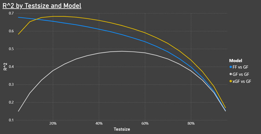
It’s interesting that you only need a very small shot count (FF) to predict future team goals. When the test-size increases then xGF becomes the better predictor for future goals.
Predicting Goals Against:

As expected, we see similar trends for goals against.
Predicting Goal differential:
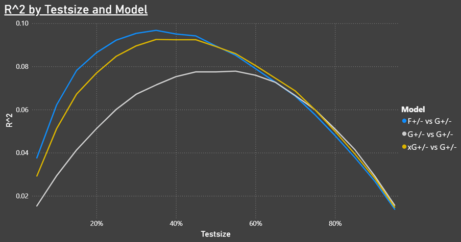
The most interesting test is how well fenwick, xG and goals can predict future goal differential. The goal in hockey is to score more goals than your opponent, so goal differential is directly correlated to team results.
This shows that Fenwick is a better predictor of future results than our xG model. We might have seen slightly different results if we had used the entire dataset instead of just the 30% test data.
There are certain things you can do to optimize the predictive power of an xG model, so like I discussed in the previous article it might be preferable to have one model for evaluating shooting/goaltending/performance and one model for predictions.
xG testing report in Power BI
I’m thinking about building a model testing report in Power BI. The idea is to make a report that can be re-used on different xG models. It will take some time to set up, but the idea is that you will have a report that you can use to compare models. This way if you update the model, you can directly compare it to the previous version… Or other analysts can send me their data, and we can compare models.
Learning through transparency is the goal.
Next article – Getting PWHL data?
I’m not yet sure what the next article will bring. Maybe I will build the xG testing report in Power BI and write an article about that… Or maybe I will show how you can get advanced data from the PWHL and AHL websites.
Contact
Please reach out if you have comments/questions or if you want to share your own work. I will gladly post it on my platforms.
You can contact me on: hockeystatistics.com@gmail.com

Hey Lars, I really appreciate you sharing your approach and especially your code. It’s always helpful to see the process behind someone else’s modeling.
I had a quick question about your evaluation method: I noticed you’re using a random 70/30 split across the whole dataset (2009–2025), which mixes data from different seasons and possibly even within the same games. From my experience, that’s often tricky because the model might be capturing information that’s not realistically available in a predictive setting. Have you tried a season-forward or rolling-origin split to keep everything truly prospective? When I switched to that method myself, I saw a noticeable drop in AUC (closer to mid-60s rather than the mid-70s). I’d be curious to know if you’ve seen something similar.
Additionally, your use of the Season variable as a predictor may be significantly contributing to your model’s performance, as it provides the model with explicit season-level knowledge during training. It’s helpful descriptively, but again, might not fully reflect what we’d have in a predictive scenario. Did you notice a performance difference when removing it?
Lastly, I liked the idea of aggregating shots to the team-level to test predictive performance, but the repeated random sampling might run into similar “prospective” issues. A straightforward test might be to fit your model up to 2023 and see how accurately it predicts team-level outcomes in 2024–25. It’d give a pretty clean look at predictive ability without mixing future/past data.
Overall, your work is impressive, and the visuals and code sharing are awesome. I think clarifying these few things about your evaluation could really strengthen your results and make the numbers even more trustworthy.
Would love to chat more or trade notes sometime!
Best Regards,
Will Schneider
LikeLiked by 1 person
Hi Will,
The xG model definitely needs some work. It was just a very basic model to be used for the tutorial. In the next version I think I will split the ice into zones instead of using shot distance and shot angle – There are some things that you don’t catch this way (e.g. behind the net shots and short distance bad angle shots).
In the next version, I will probably do logistic regression in 3 year intervals, and increasing the by one year at the time. This would mean that every season (except for the extremes) will have three regressions, where I would then take the average coefficients. I think this will improve the model significantly, but it might make it a little more difficult to test the data. Making one model over the full dataset (2009-2025) is probably not a good approach.
Anyway, you are always more than welcome to reach out on hockeystatistics.com@gmail.com. Maybe we can build something together.
LikeLike