
In this piece I want to talk about the newly created Player Cards. The player cards are meant to describe the performance in the 22/23 NHL season. These cards should be seen as temporary cards until the new models are ready.
In the coming weeks (or months) I will rebuild the models that all my visualizations are based on. After that I can start on the visualizations for the upcoming 23/24 season – If you think these cards are cool, then just wait for the future visualizations!
I plan to make all visualizations for the 23/24 season free to the public. However, these temporary (early access) player cards are put behind a paywall. You can buy a yearly subscription for just 10$ (less than 1 dollar per month). With a subscription you will get access to these cards, my eBook, the upcoming eBook and probably some more stuff through the season.
There are two ways to subscribe:
- Buy a membership via Gumroad: https://hockeyskytte.gumroad.com/l/Subscription
- Subscribe via WordPress: https://hockey-statistics.com/subscribers/
If you like my work, you should consider subscribing. It’s a great way support my continued work.
Game Score Model:
Before we can talk about the Player Cards, we need to quickly talk about the Game Score model. This model tries to estimate how much better than average a player is performing… So all the Game Score metrics are measured in Goals Above Average. There are 8 skater metrics and 1 goaltender metric:
- Even Strength xGF
- Even Strength xGA
- Powerplay G+/-
- Shorthanded xG+/-
- Individual Goals
- Primary Assists
- Penalties Taken
- Penalties Drawn
- Goals Saved Above Expected (GSAx)
For each of these metrics we calculate how much better than average a player is performing. These calculations are called delta values.
If we look at Individual Goals for instance, then we have to evaluate goal scoring at each strength respectively. So, the delta value for individual goals would be:
d(iG) = d(EV iG) + d(PP iG) + d(SH iG)
At even strength we compare the player’s goalscoring to the average goalscoring for a player at his position (forward or defender). A forward is obviously expected to score more than a defender:
d(EV iG) = ((EV_iG per minute) – (Average EV_iG per minute)) * EV_TOI
So, if the player is scoring at a lower rate than average, then he will have a negative value. If he’s scoring at a higher rate, then he will have a positive value.
This way we can calculate delta values for all the metrics. Then through regression modelling I found out how much to weigh each delta value… So, to go from delta values to Game Score Values you multiply by these constants:
| Metric | Constant |
|---|---|
| EV_xGF | 0.213 |
| EV_xGA | -0.213 |
| PP_G+/- | 0.152 |
| SH_xG+/- | 0.152 |
| G | 0.326 |
| A1 | 0.326 |
| PEN_take | -0.024 |
| PEN_draw | 0.024 |
| GSAx | 1.000 |
It’s important to note that Empty Net Situations aren’t included in the Game Score Model.
Summary:
- The Game Score Model measures performance in 9 different metrics.
- The Game Score Model compares the performance to an average player playing the same position and given the same ice time.
- Game Score is measured in Goals Above Average, so the total Game Score on a team should be equal to the team’s goal differential.
- The Game Score Model doesn’t include Empty Net Situations or Penalty Shots.
Skater Visualization
Now that we have talked about the Game Score Model, we can go on to talk about the Player Cards.
Purpose:
This visualization shows how well a skater has performed in the 2022/2023 season as well as his strengths and weaknesses.
Interpretation:
The top Bar:

In the top bar you can select the player. It then shows his Game Score values in Offense, Defense and Total. The last percentile shows where Oliver Ekman-Larsson ranked among defenders in the 22/23 season.
Offense is: EV xGF, PP G+/-, iG, A1 and Penalties Drawn.
Defense is: EV xGA, SH xG+/- and Penalties Taken.
The donut chart around the game score values indicate the percentile ranking. If it’s all blue, it means the player is in the 100th percentile.
It’s important to note that if you’re an average player (game score equal to 0), you will be above the 50th percentile. This is because the best players in the league have a greater positive impact, than the worst players have a negative impact.
Player Bio:

There isn’t much to say about the Player Bio – It pretty much speaks for itself. The contract data comes from CapFriendly(LINK).
Player Statistics:
In this section you can choose to look at either Individual statistics or Even Strength On-Ice Statistics.

All the production statistics (G, A1, A2 and Points) show the total number, but the colouring is based on delta values… So, blue means producing more than average while red means producing less than average.
GAx is Goals scored above expected (iG minus ixG) and G/xG is simply the number of goals scored per expected goal. If the value is 1, it means that the player is scoring as expected.
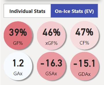
The 3 bottom stats in the On-Ice Statistics show the On-ice shooting and goaltending.
GAx is Even strength on-ice goals scored above expected (EV_GF – EV_xGF)
GSAx is Even strength on-ice goals saved above expected (EV_xGA – EV_GA)
GDAx is Even strength on-ice goal differential above expected (GAx + GSAx)
Player Type:

The Player Type chart show the percentile rank in each of the Game Score metrics. In other words, it indicates the strengths and weaknesses of the player.
Performance vs. Projection:
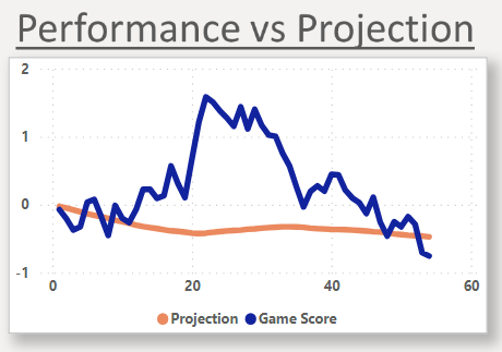
The blue line is the cumulative Game Score value over the course of the season (Running Total). The x-axis is the player’s game number, and the y-axis is Goals above expected.
The orange line is cumulative projected Game Score value over the course of the season. Before each game a projected Game Score Value is calculated and this is what goes into the Game Projections that I post over the year.
If the blue line is above the orange line it means that the player has been outperforming his projections.
Performance last 3 years:

The last graph shows the percentile ranking in Game Score for the last 3 seasons. The blue line is the total Game Score, the pink dashed line is Offensive Game Score and the orange dashed line is Defensive Game Score.
Goaltender Visualization

Purpose:
This Visualization shows the Goaltender performance for the 22/23 NHL season. You can also see how the goaltender performed compared to the projections.
Interpretation:
The top Bar:

In the top bar you can select the goaltender. It also shows Games played, Save percentage, Expected Goals against per Goal against, Goals Saved Above Expected (GSAx) and the Percentile ranking in GSAx.
The donut chart for Games played shows the number of games compared to Jake Oettinger who has the most games played (81). The other donut charts are Percentile rankings in that specific metric.
Only goaltenders with more than 500 minutes played are included in the percentile calculations. If a goaltender has less than 500 minutes, he’s defined to be in the 50th percentile.
Player Bio:

The player Bio is pretty much self-explanatory.
Time on Ice:

In the next section you can see the goaltender’s time on ice, and you can filter the goaltender table based on ice time. The slicer filters nothing but the goaltender table in the middle.
Goaltender Table:

In the goaltender table you can see the rankings of all the goaltenders. You can rank the goaltenders based on GSAx, xG/G or Sv%.
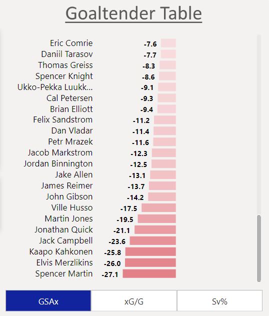
If you scroll all the way down, you can see the worst goaltenders in the selected metric.
Performance vs. Projection:

Here you can see the actual performance in GSAx compared to the projected GSAx.
Performance last 3 Years:

The final graph shows the performance in GSAx in the last 3 seasons.
