On July 15th there’s a Women’s Hockey Analytics Conference (WHKYHAC). Because of this I’m building a Visualization Project where I’m using Sportlogiq’s PWHPA data. The Visualizations can be found here: WHKYHAC Visualizations (Dark Version).
In this article I will do a short write-up on the visualizations as I build them. I will try to answer 4 questions:
- Purpose: What can we learn from the Visualization?
- Interpretation: How do we read the Visualization?
- Building: How do we build the Visualization (Video Tutorial)?
- Perspective: Could we improve the Visualization?
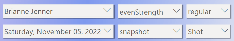
Visualization 1: Shot Plotter

Purpose:
The visualization allows you to see a player’s shot attempts plotted on a hockey rink.
Interpretation:
The size of the shot markers depends on the xG value. You can hover over each marker to see the x,y coordinates, shot type, strength state, shot event and xG value.
The top bar allows you to filter the shot data. You can filter by: Player, Strength state, Season stage (Playoffs or regular season), Date, Shot type and Shot event (Goal, Shot on net, Miss, Blocked shot).
Building:
Perspective:
Originally, my plan was to also plot passes… But that proved to be very difficult in Power BI. There may be ways to do this, but I haven’t quite figured it out yet.
However, I will probably add to this visualization eventually. There’s no need to have a full rink. We could just include the offensive zone, which would leave room for additional features. I’m thinking “Shot Aim” – where in net is the player shooting.
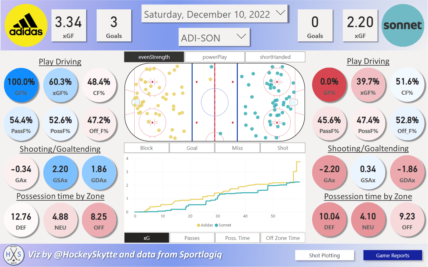
Visualization 2: Game Reports

Purpose:
In this visualization you can see team metrics, shot plots and graphical metric “races” for each game.
Interpretation:
The first thing you do is to select a date and a game in the slicers at the top. The top bar also shows the goal and xG values for each team:

Play driving:
To the left you can see the play driving metrics of the away team. To the right you see the home team:

Typically, you define play driving as xGF% and/or CF%, but with this dataset we can include other things as well.
- PassF% is the team’s number of completed passes compared to the total number of completed passes.
- PossF% is the team’s time possessing the puck compared to the total possession time – There’s typically around 5 minutes per game (according to the data), where no team is in possession of the puck.
- Off_F% is the team’s possession time in the offensive zone compared to the total possession time in the offensive zone.
The color-coding goes from 0% (red) to 100% (blue) for GF%, and from 20% (red) to 80% (blue) for the rest of the Play driving metrics.
Shooting/Goaltending:

Below the play driving metrics, you find the Shooting/goaltending metrics:
- Goals Scored Above Expected: GAx = GF – xGF
- Goals Saved Above Expected: GSAx = xGA – GA
- Goal Differential Above Expected: GDAx = GAx + GSAx
The color-coding goes from -4 (red) to +4 (blue) for all the metrics.
Possession time By Zone:

The last team metrics in this visualization are possession times (in minutes) by zone. The average possession time in the defensive zone is 12.91 minutes, the average possession time in the neutral zone is 5.26 minutes and the average possession time in the offensive zone is 10.04 minutes.
The color-coding in the defensive zone ranges from average +/- 5 minutes, in the neutral zone it ranges from average +/- 2 minutes and in the offensive zone it ranges from average +/- 4 minutes.
All the average values are based on All Strengths, so you should be aware of this if a different Strength State is selected.
Slicers, Shot plot and Graph:
In the middle of the visualization, you find 3 Slicers, a Shot plot and a Graph:
- Strength State Slicer: The top slicer filters the entire page (except the “Race” Graph) based on Strength State.
- Shot Event Slicer: The middle slicer only filters the Shot plot.
- Metric Slicer: The bottom slicer selects which graph to show: xG, Completed Passes, Possession Time or Possession Time in the Offensive Zone.
- Shot Plot: Shows all the shot attempts with the selected filters. You can hover over each marker to see additional information about the shot.
- The graphs: Shows the “Race” based on the selected metric.
Example:

With this selection we see all Even Strength Goals plotted on the Shot plot, and we see the All Strengths xG Race in the Graph.
Building:
Part I
Perspective:
In this visualization I’m only focusing on the Team Statistics, but you could also include player data. Theoretically, you could create a Game Score Model to estimate how well each player performed in the game. Then instead of showing just the team metrics, you could make button that allows you to toggle between team metrics and a player table with game score values. This could be pretty cool.
