Introduction
The purpose of this project is to look at the player positioning in relation to the puck position. I’ve created a tool that splits the ice rink into smaller zones. You can then select a specific puck position to see the corresponding player positions – Either as a heat map or as the average player position(s).
The idea is that this can be used by coaches and players as a tactical tool. Here are some examples:
- Understand and determine defensive structure (especially when playing zone coverage)
- Determine special teams structures
- To find asymmetries in the play (e.g. the puck being more on the right side of the ice when a certain player is on the ice)
- Are defenders being activated in the offensive zone?
I’ve also used the Stathletes data to estimate player positions. Of course, you would typically already know the player position, but potentially you could use this type of analysis to determine the player type/role – E.g. differentiate between a defensive defender and an offensive defender.
The tool itself is the project. I’m not trying to answer one specific question. The analysis section below should merely be seen as usage examples for the tool.
The project was always meant to be open-ended. The slicing of the data is designed to be as unconstrained as possible, so that the end user can define and answer their own questions.
If I were to define a single question asked in this project, it would be:
Where are players positioned in relation to the puck position?
That is of course a very broad question, but that is the whole point.
Link to the Player Tracking Tool
The Data
The primary data source is naturally Big Data Cup. I’ve decided to include the game between Team A and Team B as well. Here’s the data used in the project:
- Events from Big Data Cup
- Shift from Big Data Cup
- Tracking from Big Data Cup
- Camera_Orientations from Big Data Cup
- Teams (I’ve created custom logos and colors for each team)
- BoxID data (used to split the ice into smaller zones)
- GeoJSON (used in the rink visualizations in Power BI)
How it’s built
Data cleaning and building a database in MySQL:
I’ve used MySQL to clean and transform the data files (This is the Code). The output files after the data cleaning process are as follows (click to download the CSV files):
- Teams
- Games
- PBP_Data (Events)
- Shift_Index
- Player_Shifts
- Tracking_Puck (large file!)
- Tracking_Players (large file!)
- Player_Id
- BoxID_Data
- Camera_Adjustments
Building the Power BI Report:
All the data is imported directly from the MySQL database to Power BI. I won’t go into details about how the Power BI report is built, but the rink visuals are built with the Icon Map custom visual and using the GeoJSON file from my GitHUB.
Here’s a link to the Power BI file: BDC25.pbix
How to use the Tool:
Analysis
Limitations of the data:
There are some limitations of the data:
- Sample size: We only have data from 4 games, so it’s difficult to be conclusive with any trends.
- The tracking data comes from the video broadcast: Since the tracking data stems from the video broadcast (and not tracking chips), we often have missing player data. Simply because a player is not in the video feed. This is especially a problem in rush situations.
- The puck is missing: It’s very difficult to track the puck from a video feed, so sometimes it’s missing. I think this is less of a problem in this particular project since we’re mostly focusing on player positioning in relation to the puck. Meaning we’re just ignoring the situations where no puck is tracked.
The average Puck Position:
Simply looking at the average puck position (x,y) can tell you a lot:
- What is the average x value? Is the puck more in the offensive zone (positive x value) or more in the defensive zone (negative x value). Of course you would need to adjust for zone-start.
- What is the average y value? Is the puck more on the left side (positive y value) or more on the right side (negative y value). For instance, if the y value is negative when the puck is in defensive zone and you’re not possessing the puck (defending), then you’re probably defensively weaker or less aggressive on your right side.
The average Player Positions:
Similarly to the average puck position, you can also look at the average x and y positions for the player(s).
- Is a right winger playing on the right side? Is this what we want?
- Are defenders being activated in the offensive zone?
Estimated Player Positions:
In the project I’ve made a simple estimation of player positions. I’ve simply taken the sum of the average player position at 5v5 in the offensive zone and the average player position at 5v5 in the defensive zone.
Here’s how the positions are defined:
- G: x<-80
- RD: x>-80, x<-8 and y<-2.2
- LD: x>-80, x<-8 and y>2.2
- D (undetermined side): x>-80, x<-8, y>-2.2 and y<2.2
- RW: x>-8 and y<-2.2
- LW: x>-8 and y>2.2
- C: x>-8, y>-2.2 and y<2.2
It’s very simple to differentiate between forwards and defenders, and relatively simple to determine the side of the defenders. However, it’s very difficult to differentiate between the different forward positions. Maybe the results would be clearer with more data. Otherwise, you would need to include additional data.
Here’s the data points for the estimated positions:
Figure 1: Average player positions in the defensive zone + Average player positions in the offensive zone.
The future idea is that you can use average player positions as input in a cluster analysis. I would probably differentiate between offensive zone positioning and defensive zone positioning, and include information like shots per possession, passes per possession, puck carry distance per possession and perhaps direction of passes.
With this information you will likely be able to determine the role/style of the player: Offensive minded, defensive minded, high or low risk taker, shooter, playmaker, puck carrier etc.
Coaching Perspective:
In the last part of the analysis section, I will use the tool from a coaching perspective.
A powerplay that sets up on the right side of the ice:
Figure 2: 5v4 puck position for Team B when in possession of the puck (275 seconds)
Activating the defenders in the offensive zone:
Here’s two examples of defender positioning when the team is possessing the puck the offensive zone. One team has defenders standing on the blue line, and one team has defenders playing deeper in the zone.

Figure 3: 5v5 defender positions when Team E is in possession of the puck in the offensive zone (avg. x=34.7)
Figure 4: 5v5 defender positions when Team B is in possession of the puck in the offensive zone (avg. x=42.4)
On average the defenders on Team B are almost 8 feet closer to the net than the defenders on Team E.
Left Defender positioned differently when the puck is on the right boards:
Why is one of the left defenders so much closer to the puck? Did he/she play some of the game as a right defender? Is the player positioned correctly according to the strategy?
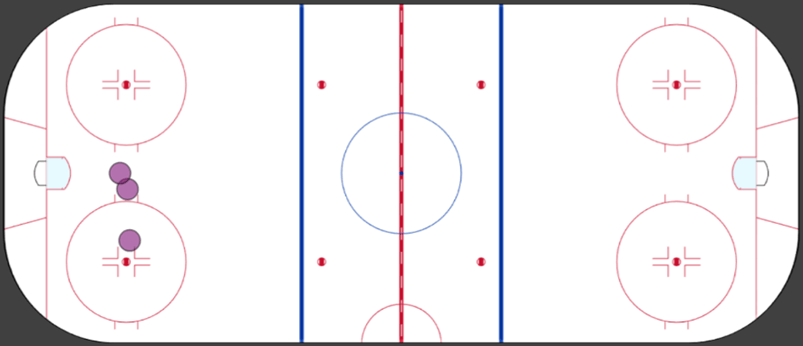
Figure 5: 5v5 average position for Team A left defenders when the puck is on the right boards.
Conclusion
This tool was always designed to be used primarily by the coaching staff. It’s then up to the coaching staff to make the analysis. Hopefully, this tool can help them confirm what they see on the ice or help them notice trends that they didn’t see on the ice.
Making the visuals on a hockey rink can help coaches and players understand the data better – It’s within their comfort zone. It can be difficult to interpret charts and scatterplots if you’re not used to seeing them.
For future work you would probably like to couple the Tracking Tool with the Event data. Right now, we’re simply visualizing the player and puck positions. We’re not necessarily trying to determine the optimal positioning. If we know the Events/results of specific positions, then we can start determining which position is the optimal one.
I tend to think like a coach first and an analyst second. This means that I’m not always focused on questions and answers. I think in terms of tools – What kind of tool would I like to have as a coach?
If I had access to tracking data, then this would be the first tool I would setup. Not because it’s a perfect tool, but it’s relatively simple to create and you would get important insights right away. Working with tracking data can be very overwhelming, I imagine.
