This project was made for my upcoming presentation at 2024 Linköping Hockey Analytics (LINHAC) from June 3rd to June 5th. You can find the Visualization Tool here.
Abstract
The typical data analysis methodology is to ask questions and then seek answers. My approach in this project is somewhat different. The main goal here isn’t to narrow in on one specific question – it’s actually the opposite. The goal is to present the data in a detailed and completely customizable way, so that the end user can ask their own questions and find their own answers.
There are 3 general goals:
- Visualizing the data with as few constraints as possible – How can we best visualize this amazing data?
- Finding questions to answer using the visualization tool – What insights can we get using the tool?
- Create a tool that speaks “hockey language”. The rink visuals will allow the user to get insights in a visual manor – Coaches and players are very comfortable understanding and interpreting lines on a whiteboard. That is basically what the rink visuals are.
The main goal with this project is to simply visualize the data as well as possible. It’s only secondary to get any insights from the data. This is a very conscious approach – I don’t want to be constrained in my viz building process and looking for a specific answer will send me down a particular path – That’s not the aim here.
This project is not about statistical modelling or predicting future results. It’s about visualizing and interpreting Sportlogiq’s play-by-play data.
Theory
Before getting into the analytical aspect of this project I would like to discuss some theories from a coaching/scouting perspective. I think this will help the reader better understand my approach and thought process.
Evaluating players through actions/plays:
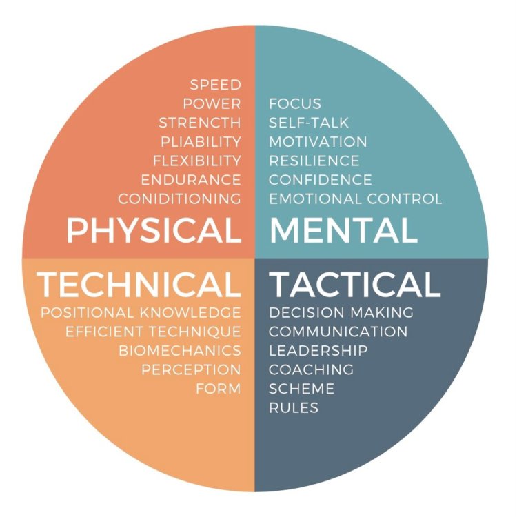
The classical way to evaluate players is through the 4 pillars: Technical, Tactical, Physical and Psychological/Mental. How good is a player at each pillar?
I like to evaluate players a bit differently. How well does a player see, choose and execute plays? In other words, I think of each play as a three-step process: Perception – Decision Making – Execution.

Perception
I think there are two types of perception: Natural Perception and Trained Perception.
Natural Perception is something you’re born with. Some players are gifted with a great sense of the ice. They appear to see things faster and better than everyone else.
However, there are plenty of ways you can train your perception as well. Scanning the ice requires effort and focus, so if you’re technically and physically gifted then you can allocate more focus on the perception and decision making. Being able to look up while possessing the puck (split vision) is an integral perception skill.
If you have a great tactical understanding, then you know what to look for and where to look. This allows you to zoom in on the most important things. Thus improving your perception.
Finally, you can improve your perception by communicating. When players are communicating, they don’t have to rely solely on what they see but they can use their hearing as well.
Decision Making
I think it’s important to understand that decisions can be made either consciously or unconsciously. Sometimes you’re playing on instinct and sometimes you’re consciously following a strategy. When players have instant chemistry it’s because their unconsciously made decisions fit together.
Experience (learning from your mistakes) should hopefully help you make better decisions. Being able to anticipate plays is also incredibly helpful in your decision making.
Good decision making basically boils down to a Risk vs. Reward assessment. Does the potential reward outweigh the risk of the play? For very skilled players it’s probably worth playing a high risk / high reward style of game, whereas for others it’s better to play a low risk / low reward game. It all depends on the player’s ability to execute tough plays.
My final point on decision making is about offense vs. defense. I think it’s important to view offensive intelligence and defensive intelligence as two completely separate skills. Players can be great at one or the other or both, but I don’t think they’re necessarily connected. Instead of hockey IQ, we should probably talk about offensive IQ and defensive IQ.
Execution
The final step is the execution. These are all the things we see. How fast is the player? How good is the shot? The passing? The hitting? And so on…
The decision making should of course match the player’s ability to execute plays. Sometimes we see players try to execute plays that are way too difficult for their skill level… But we also see the opposite. Players that play way too low risk considering their skill level. Probably because they are afraid to make mistakes.
Psychological and Physical Aspect
I don’t want to go into details… But I just want to mention that psychology and physiology obviously impact plays. A player with high confidence is more likely to play with high risk and more likely to successfully execute difficult plays. A low confidence player will likely choose low risk plays.
Likewise, at the end of a long shift when the player is tired, it will impact negatively the decisions and execution.
I generally think perception is less affected by psychological and physical aspects than decision making and execution.
Time or Quality the Limiting Factor?
Up until this point we’ve only discussed how well a player performs in each step… But how quickly the player performs each step is equally important.
It’s not just how well you scan the ice, but also how quickly. It’s not just how good your decisions are, but also how quickly you make them. It’s not just how good your execution is, but also how quick it is. Getting a shot off quickly before the goaltender has time to set up, is often more important than raw power and accuracy.
Time in this regard is an interesting concept. The importance of time is difficult to quantify, but I like to use a Quarterback as the analogy. If the defense is Blitzing, then time is limited and executing quickly is of the utmost importance. If you’re too slow, you’ll get sacked. It’s the same in hockey. If you’re too slow you’ll get pressured or hit before you can make a play. In that case it’s almost irrelevant how good your execution is. You’re limited by time.
If time is the limiting factor, then you can work on two things:
- Executing quicker.
- Buying more time.
Going back to the quarterback analogy. He must either release the ball quicker or buy more time (usually by moving around in the pocket). A hockey player can likewise buy more time by moving his feet.
It’s important to know if a player needs to make better decisions or needs to make quicker decisions. It’s two different things you need to practice. Playing on instincts is faster than making conscious decisions.
When you move from one level to the next (e.g., Juniors to Pro), you will have less time – Pressure comes on you quicker. Sometimes we see players completely dominate at one level and be almost invisible at the next level. This could be an indication that time has become the limiting factor. The player doesn’t even know what play to execute before the puck is lost.
Statistical analysis:
All (or almost all) publicly available hockey analysis is based solely on the play execution – What happens on the ice? I would call this event analysis. Alternatively, we could analyze possessions. This would give us additional insights – Puck carrying information and Possession time. In other words, we get some intel on the quickness of the play execution.
Obviously, possession analysis requires a very detailed dataset. We need to be able to determine when and where a possession starts and when and where a possession ends.
Green, Yellow and Red plays:
I’m used to talking about Green, Yellow and Red plays when discussing low risk, medium risk and high risk plays. Here’s my definition of the three play types:
- Green plays: There are no opponents nearby.
- Yellow plays: You’re close to the opponent and force a reaction from the defense.
- Red plays: You try to go through an opponent – Can be a pass through traffic or a one-on-one challenge.
I think offensive success comes from either stringing together multiple yellow plays or by executing red plays. The key part is finding the right balance between green, yellow and red plays. Constantly trying to execute red plays against a balanced and structured defense will lead to a lot of turnovers. You will often want to get the defense out of balance before going for the red play.
On the other hand, if a player only makes green plays, then you’re always allowing the defense reset – regaining the structure. This can be a real momentum killer.
Defensive Strategies/Mindsets:
Without getting into concrete defensive systems, I like to think about defense through these three general strategies:
- Taking away the red plays: You play a compact defensive game to secure the slot. The goal is not to allow a goal.
- Steering the play: You take away certain plays while allowing other plays to lure the offense to play in a particular way. The goal is to control the direction of the play.
- Taking away the green plays: You try to take away all the easy plays. The goal is to win the puck.
There are advantages and disadvantages with the different strategies. It depends on the circumstances, and often you would play different strategies based on the situation. For instance, you might want to steer the play to a specific location (strategy 2) and once it’s there you want to win the puck (strategy 3).
In the end, the most important thing is that all the players work together as a unit. They need to follow the same strategy – Have the same mindset. If the goal is to win back the puck in the offensive zone, then you can’t have a defender backing off – he will need to pinch. Otherwise, there’s a simple pass along the boards and a rush against.
Strategic analysis
With this dataset we can visualize every single puck possession and pass. This allows us to do a strategic analysis as opposed to a statistical analysis.
Which players are attempting green plays and which players are attempting red plays? Are we succeeding in controlling the direction of the play? Are we winning pucks where we want to win pucks? What’s the strategy of our upcoming opponent?
Data
For this project I’m using Sportlogiq’s 2022/2023 PWHPA play-by-play data. It was released a year ago as part of the Viz Launchpad Competition at the Women’s Hockey Analytics Conference (WHKYHAC).
The Raw Data
This is what the raw play-by-play data looks like. It’s split into two images to fit all the columns:


Columns in the data
- seasonstage: Regular season or Playoffs
- date
- teamname: Event team.
- opposingteamname: Opposing team.
- ishomegame: Whether the event team is at home or not.
- game
- teaminpossession: The team possessing the puck.
- currentpossession: Index of the team possessions.
- period
- compiledgametime: Game time in seconds.
- scoredifferential: Goal differential from the perspective of the event team.
- strengthstate: Strength state from the perspective of the event team.
- teamskatersonicecount: Number of skaters on the ice for the event team.
- opposingteamskatersonicecount: Number of skaters on the ice for the opposing team.
- player: Name of the event player.
- position: Position of the event player.
- goalie: Name of the goalie of the event team.
- opposinggoalie: Name of the goalie of the opposing team.
- eventname: Type of event.
- outcome: Whether the event was successful or not.
- type: Additional information about the event.
- xadjcoord: x coordinate of the event.
- yadjcoord: y coordinate of the event.
- xg_all_attempts: xG value based on the All Attempts Model (Corsi Model).
- goal: Whether the event was a goal or not.
- createsrebound: Whether the event created a rebound or not.
- onetimer: Whether the event was a onetimer (one-touch) or not.
- shotaim: Aim of the shot.
- shottype: Type of the shot.
Event Types in the data
- assist
- block: Can be either a shot block or a pass block
- carry: Carries are only included in the dataset in relation to zone entries and zone exits
- check: Check by the defending player – Can be either stick check or body check
- controlledentry: Controlled zone entry – Both successful and failed entries are included
- controlledentryagainst: Controlled zone entry from the perspective of the defending player
- controlledexit: Controlled zone exit – Both successful and failed exits are included
- dumpin
- dumpout
- faceoff
- icing
- lpr – Loose puck recovery
- offside
- pass
- penalty: The player taking the penalty
- penaltydrawn: The player drawing the penalty
- puckprotection: The puck carrier is contested by a defender
- rebound: A rebound is always associated to a loose puck recovery, so there are two events for a rebound
- reception: Pass reception – Can be a failed reception if the puck jumps on the stick. Then the pass is considered to be successful
- save
- shot: Can be a blocked shot, missed shot, shot on net or goal
- sogoal: Shootout goal
- soshot: Shootout shot
This data is obviously great and very detailed, but there are things we can’t extract from the data. We don’t have information about who’s on the ice for each event. We also don’t have access to any shift data from where we can get that information.
This means that we can’t calculate things like on-ice possession time (for and against) or on-ice possession time by zone. It could be fun to dig deeper into the more advanced on-ice statistics like this, but that’s unfortunately not possible with this specific dataset.
It’s also worth noting that the data consists of just 40 games, so there are some limitations in terms of sample size.
My final point about the dataset is on the xG model. In the play-by-play data we have the xG_all_attempts value, which means that all shot attempts have an xG value. However, Sportlogiq also have a “shot on net” xG-model, which would be the preferred model for goaltender evaluations. However, the shot based xG model isn’t available in the play-by-play data. This particular project doesn’t involve goaltender evaluations, so it’s not a big problem here.
Data Transformation
Before the visuals could be build, I needed to do a lot of data transformations. It’s too complicated to explain all of the transformations here, but here’s the most important ones. They should give you an idea of the process.
- Added Events: Goal, Shot On Net, Missed Shot, Blocked Shot, Complete Pass, Incomplete Pass.
- Added Player Possession Index: Start Events and End Events.
- Added Possession Time.
- Added destination Coordinates: The previous Event by the same player in the same player possession.
- Defined the above Events as Puck Carries: We have the destination from the previous event, so if we draw lines between the Coordinates and Destination Coordinates we will get the puck carries.
- Added Passes: With destination coordinate of next event.
- Added Dump Ins/Outs: With destination coordinate of next event.
- Passes and Dump Ins/Outs will appear twice in the dataset (both as carries and passes/dumpins/dumpouts) – Only carries have a Possession time.
- Calculated distance between destination coordinates and coordinates (carry distance and passing distance).
- Calculated Shot distance: Distance between the shot coordinate and the net.
- Calculated Shot angle and angle (to the net) from the previous completed pass in the same team possession – Used this to calculate delta Angle.
- Added Zone
- Added StartZone of the TeamPossession.
The Rink Visuals – A Micro Statistics Tool
With the above data transformations, I was able to create a tool that allows you to visualize the data on a hockey rink. You can find the tool here.
I don’t want to go into any details about how to build this visual, but it’s created in Power BI and the Rink Visual is a custom visual called Icon Map – Shout out to James Dales and Icon Map.
The rink tool consists of two separate visuals – One for looking at Events and one for looking at Team Possessions. You can switch between the two visuals by using the TABS on the right side.

The Event Visual:
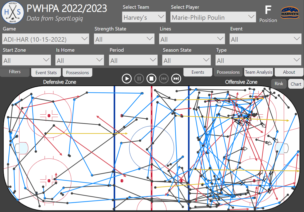
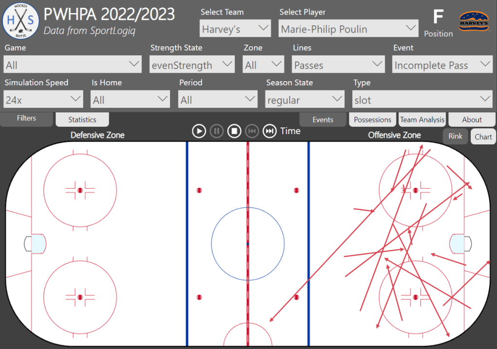
Let’s start with the Event Visual. You can filter the events by Team, Player, Game, Strength State, Zone, Venue, Period and Season State. Then you can also filter by Lines, Event and Type, but I will expand on this later.

Black lines are puck carries, Blue lines are completed passes, Red lines are incomplete passes and Yellow lines are dump ins/outs.
The puck carries (black lines) show the distance between the event and the previous event. A black double arrow is a shot attempt.

If we choose to look at completed passes, but don’t specify which lines we want to include, then the visual will show both black and blue lines. Completed passes, Incomplete passes and Dump Ins/Outs have two rows in the dataset (see Data Transformations).
The black line is the puck carry before the pass, and the blue line is the actual pass (image 2 only shows the passes).
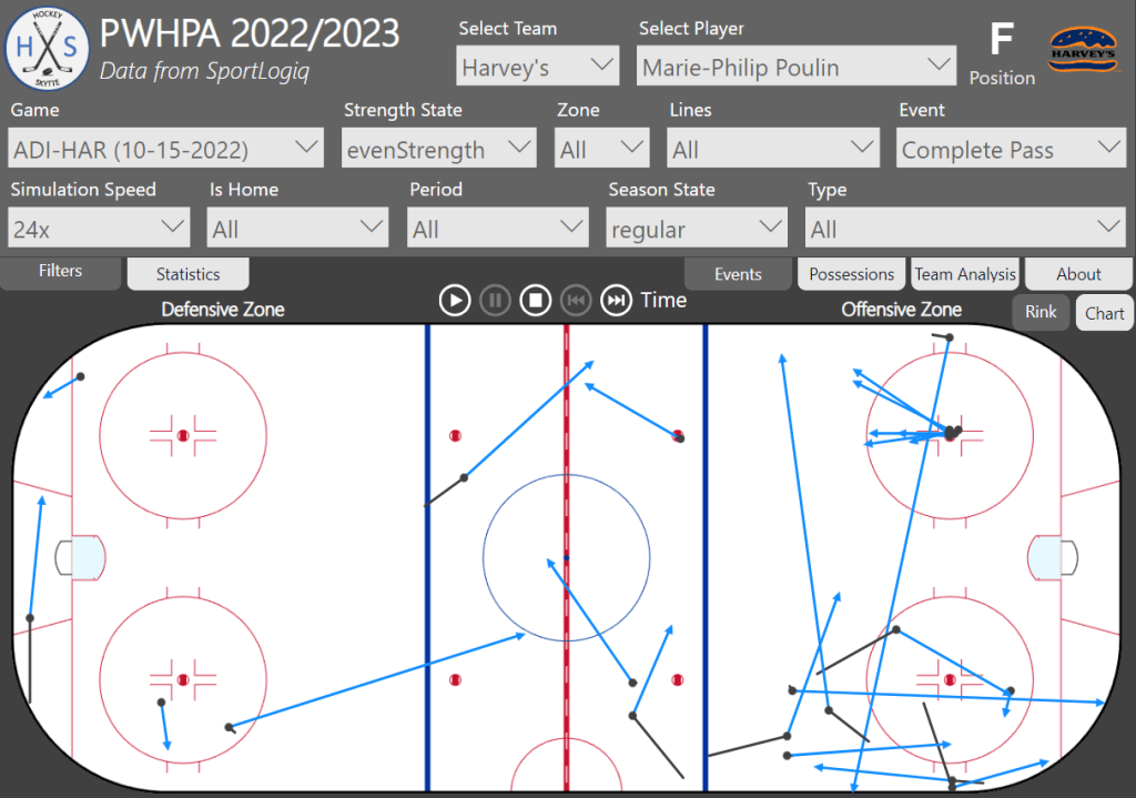
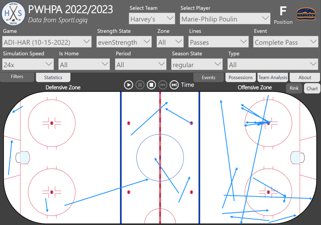
You can also specify the Type. Here’s it’s all Completed Slot passes by Marie-Philip Poulin at Even Strength in the regular season.

It’s important to understand that we don’t actually know the intended target of incomplete passes – We just know where the pass is eventually picked up or blocked. This is why we see incomplete slot passes that aren’t going to the slot. For this reason, I’m not including incomplete passes in the average passing distance metric.
It’s also possible to simulate the events based on Game Time. You can change the game speed – How much the game time jumps for every interval. The visual updates every five seconds. For now, the events are just added to the visual for each update, but ideally the “new” events would be highlighted and the “old” events would be somewhat transparent. That will have to be in version 2.0, though.
In the Statistics Tab you can see the data, and it will update during a simulation.

- #Possessions: The total number of Player possessions.
- Poss. Time: The average player possession time in seconds.
- Poss. Distance: The average puck carry distance.
- #Comp. Passes: The total number of Completed Passes.
- Pass Distance: The average distance of Completed Passes.
- Completion%: The percentage of Completed Passes.
- Assists: Number of Assists.
- #Puckprotections: Number of Puck Protections – The puck carrier is contested.
- Successrate: Percentage of successful puck protections.
- Goals: Number of Goals.
- Shots On Net: Number of Shots on net.
- Missed Shots: Number of Missed Shots.
- Blocked Shots: Number of Blocked Shots.
- xG: The total xG – Based on the All Attempts model (Corsi Model). Sportlogiq also has a Shot-On-Net model, but that’s not available in the play-by-play data.
- Shot Distance: The average Shot Distance.
- Shot Time: The average player possession time in seconds before a shot is taken.
- Sh%: Shooting percentage.
- GAx: Goals Scored Above Expected (GAx = Goals – xG).
Below you see the passing maps (completed passes) and carry maps of two different defenders. This is just to illustrate how you can also use the tool.
Savannah Harmon even strength completed passes and puck carries:


Kristin Richards even strength completed passes and puck carries:


A few things jump at us right away. Kristin Richards is clearly playing as a right defender and she is very much staying at the right point position in the offensive zone.
Savannah Harmon on the other hand has much more symmetrical maps, indicating that she probably played both as a left defender and as a right defender… Or she has a more free role in terms of positioning. She is also much more activated deep in the offensive than Kristin Richards.
This was just a simple example of how you can also use the visualization tool.
The Possession Visual:
The Team Possession Visual is different. Now we filter the Team possessions… So, this is all the Team Possessions by Harvey’s in the game Adidas on October 15th where Marie-Philip Poulin had at least puck touch.

If we choose to filter by Goals, then we will see all Harvey’s possessions that lead to a goal. The play function (simulation) can be used to go through all the team possessions one possession at a time.

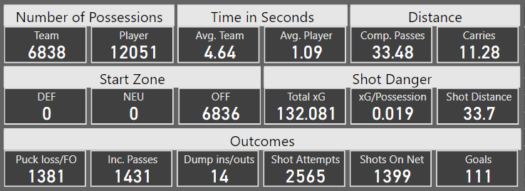
In the Possessions Tab there’s a table to the right where you can select a specific team possession to highlight that possession. You can also see data about the possessions. Harvey’s scored 68 goals and 150 players possessed the puck on those team possessions.

- Number of Possessions:
- Team: Total number of Team Possessions.
- Player Total number of Player Possessions.
- Time In Seconds:
- Avg. Team: Average Team Possession Time in seconds.
- Avg. Player: Average Player Possession Time in seconds.
- Distance:
- Comp. Passes: Average Distance of Completed Passes.
- Carries: Average Distance of Puck Carries.
- Start Zone:
- DEF: Number of Team Possessions that started in the Defensive Zone.
- NEU: Number of Team Possessions that started in the Neutral Zone.
- OFF: Number of Team Possessions that started in the Offensive Zone.
- Shot Danger:
- Total xG: Total sum of xG (All Attempts Model).
- xG/Possession: The average xG per Team Possession.
- Shot Distance: The average Shot Distance.
- Outcomes:
- Puck Loss/FO: Number of times a Team Possession ended with a puck loss (failed puck protection or failed reception) or a Faceoff (e.g. Offside, Icing, puck out of play)
- Inc. Passes: Number of times a Team Possession ended with an Incomplete Pass.
- Dump ins/outs: Number of times a Team Possession ended with a Dump In or Dump Out.
- Shot Attempts: Number of times a Team Possession ended with a Shot Attempt.
- Shots On Net: Number of times a Team Possession ended with a Shot On Net.
- Goals: Number of times a Team Possession ended with a Goal.
It’s worth noting that saves and blocks reset the team possession… So, if you score on a rebound, it’s counted as two separate team possessions. One team possession can never have more than one shot attempt.
Analysis of Team Possessions:
Let’s take a look at the team possessions in greater detail. We will start by looking at the team possessions that end up becoming a goal.
Goal Possessions: Team possessions that lead to a goal
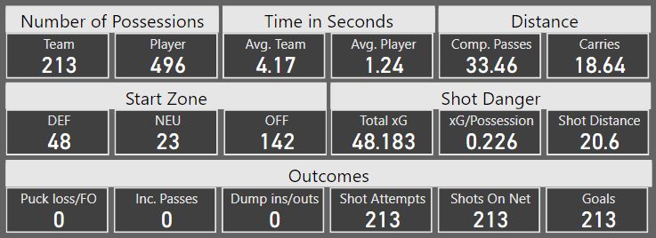
Let’s quickly walk through the data on goal possessions:
- Possessions: On 213 goal possessions a total of 498 players possessed the puck – 496/213 = 2.33 player possessions per goal possession.
- Time: On average the team possessed the puck for 4.17 seconds and each player possessed the puck on average for 1.24 seconds. Both of which is lower than the average of all team possessions (see below).
- Distance: The average passing distance (completed passes only) is 33.46 ft and the average puck carry distance is 18.64 ft.
- Start Zone: 142 of the goal possessions start in the offensive zone (67%). This is much higher than for the average team possession. Just remember that all blocks and saves reset the team possession, so all rebound goals will by definition start in the offensive zone.
- Shot Danger: The average xG value on goals is 0.226 and the average shot distance is 20.6 ft. Goals are being scored from very close range.
- Outcomes: Not much to say here, since we’re only looking at the possessions that lead to goals.
Conclusion: Goals are being scored when playing quicker than average – Shorter team possession time and shorter player possession time. Goals are being scored from very close range in the PWHPA and the majority of the goal possessions start in the offensive zone.
Team Possessions by Strength State
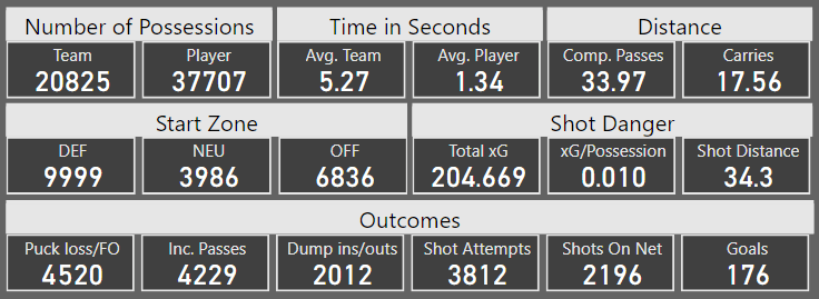
Here’s the data on all even strength team possessions in the dataset:
Here’s the data on all powerplay team possessions in the dataset:

Here’s the data on all shorthanded team possessions in the dataset:

Let’s walk through the data quickly:
- Possessions: The average number of player possessions per team possession is: 1.81 (EV), 2.95 (PP) and 1.42 (SH).
- Time:
- Average team possession time: 5.27 seconds (EV), 10.30 seconds (PP) and 3.15 seconds (SH).
- Average player possession time: 1.34 seconds (EV), 1.60 seconds (PP) and 1.06 seconds (SH).
- Distance: The average passing distance and the average puck carry distance is surprisingly similar at all three strength states – Around 34 ft per pass and between 15 and 18 ft per carry.
- Start Zone:
- Defensive Zone: 48.0% (EV), 27.7% (PP) and 79.5% (SH).
- Neutral Zone: 19.1% (EV), 10.7% (PP) and 10.1% (SH).
- Offensive Zone: 32.8% (EV), 61.5% (PP) and 10.5% (SH).
- Shot Danger: xG per possession: 0.010 (EV), 0.022 (PP) and 0.006 (SH).
- Worth noting that xG total generally is higher than the actual goals scored – Meaning the goaltenders across the board performed better than expected.
- Outcomes: Possessions where the outcome is a shot attempt: 18.3% (EV), 37.0% (PP) and 8.3% (SH).
- Unsurprisingly most of the possessions on the penalty kill end with a dump out.
Conclusion: Possessions on the powerplay are much longer than possessions at even strength. More players possess the puck and each player possess the puck for a longer time.
More possessions on the powerplay lead to a shot attempt (37%) and thus are the expected value of a powerplay possession (0.022) worth a lot more than an even strength possession (0.010). This means that each possession on the powerplay has a 2.2% expected chance of becoming a goal. It’s 1.0% at even strength. The actual scoring percentage is slightly lower though, because the goaltenders are performing better than expected!
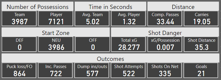
Even strength Team Possessions by Start Zone
Defensive Zone:

Neutral Zone:
Offensive Zone:
Let’s walk through the data quickly:
- Possessions: The average number of player possessions per team possession is: 1.86 (DEF), 1.79 (NEU) and 1.77 (OFF).
- Time:
- Average team possession time: 5.69 seconds (DEF), 5.02 seconds (NEU) and 4.64 seconds (OFF).
- Average player possession time: 1.50 seconds (DEF), 1.32 seconds (NEU) and 1.09 seconds (OFF).
- Distance: The average passing distance is pretty much unchanged based on Start Zone… But the average carry distance is much shorter for team possessions that start in the offensive zone.
- Start Zone: Nothing to say here, since we’re filtering by Start Zone.
- Shot Danger: xG per possession: 0.004 (DEF), 0.007 (NEU) and 0.019 (OFF).
- Obviously, a possession starting close to the net is more dangerous than a possession starting further away.
- Outcomes: Possessions where the outcome is a shot attempt: 7.3% (DEF), 13.1% (NEU) and 37.5% (OFF).
Conclusion: If a possession starts in the offensive zone, then there’s less time and space – The average possession time is shorter and the same is true for the average carry distance.
Team possessions starting in the offensive zone have a much higher probability of resulting in a shot attempt and therefore also a goal.
This is something you need to account for when deciding how aggressive to be on the forecheck. Winning the puck in the offensive zone is worth more than winning the puck in the defensive zone!
Hockey Language vs. Data Analysis Language:
Strategic tool – This tool is not so much about who is performing well and who is likely to perform well in the future. Those are typical data analysis questions. This is more about answering why players and teams are succeeding or failing. What can we do to improve performance and how can we counter other teams and other players?
Understanding and drawing lines on a whiteboard is something all players and coaches are very comfortable with. This is why I think the rink visuals are more hockey language than data analysis language.
The Chart Visuals
In this next section we will look at the chart visuals. You can go to the chart mode by clicking on the Chart button.
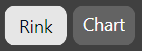
Be careful how you filter the data when switching between Chart and Rink mode. If you look at the data unfiltered and click on the Rink button, it will try to plot all events on the rink. That will require a lot of memory, and you won’t get any useful insights from the visual anyway.
Here’s how the chart works: You select a category, a value and a secondary category as the legend.
In this case the data is filtered to only show even strength data, but otherwise there are no filters. The value selection is “count”, so the measure just count events based on the filter and category. The category is “Event” and there’s no selected legend. The resulting chart is therefore just a count of events based on event type.

In the next chart we’ve filtered the data to only include even strength complete passes and incomplete passes. We’ve also selected “Period” as the legend, so the chart counts even strength completed passes and incomplete passes based on period. Interestingly enough, there seem to be more even strength passes in the first period – Perhaps because there are fewer penalties and thus more even strength time.
In the next chart, “% of legend” is selected as the value, and shot type is selected as the legend. The resulting chart shows the shot type distribution based on the category.

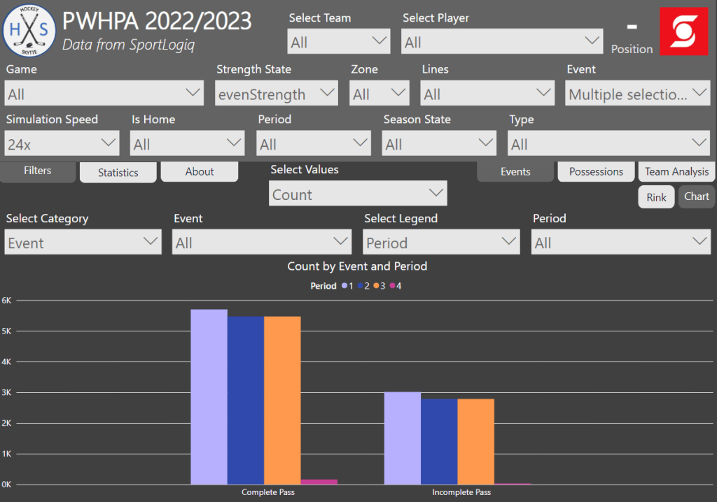
If no legend is selected, then you can choose multiple values. In this case, “Position” is selected as the category whereas “Goals”, “xG” and “GAx” are selected as the values.

In the next chart we’ve selected average “Shot Distance”, “Pass Distance” and “Carry Distance” as the values. We see that there are no registered shot attempts by goalies. We also see that defenders shoot from further out and complete longer passes, while forwards generally carry the puck for a longer distance. Nothing surprising about those findings.
The idea with this chart tool is that you zoom way out to look at league-wide trends (which is what we have done so far)… But you can also zoom all the way in to a very specific situation. Here we’ve zoomed in to Alex Carpenters plays in a specific game on the powerplay in the offensive zone.
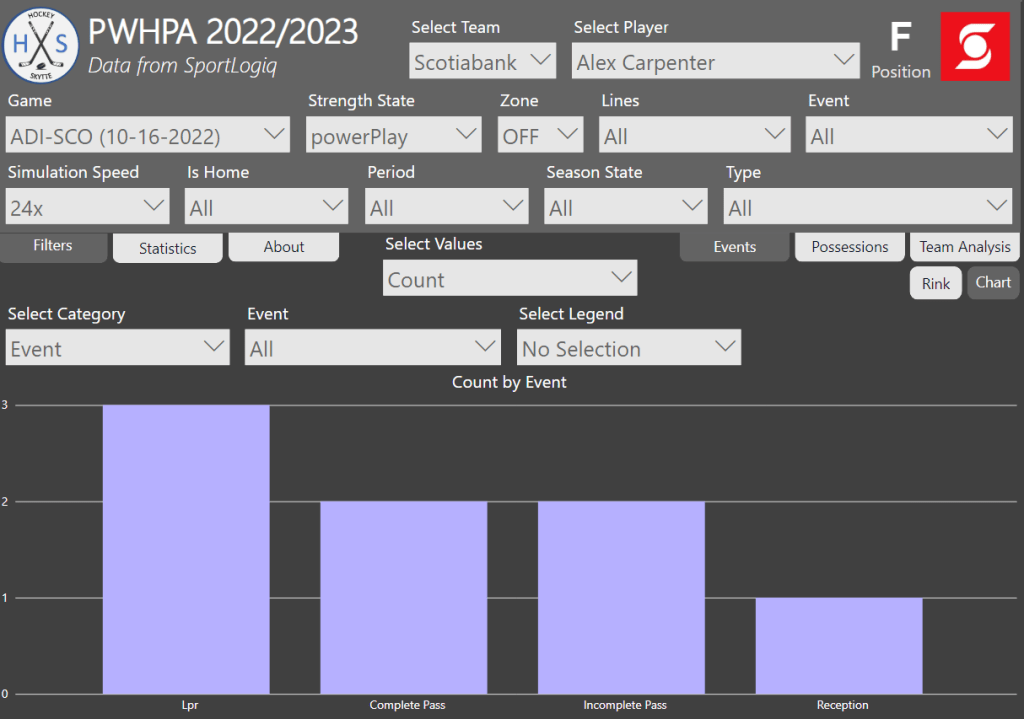
In this case it makes sense to also show the rink visual.

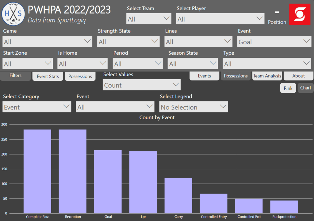
The chart visual in the possession page works in the same way except the data is filtered by team possessions and not events. In this case, we’ve filtered the data by goals, so it shows all the events in the team possessions that lead up to a goal.
This was a short walk-through of how to use the chart visuals. In the next section we will use the chart visuals to look a little bit deeper at possession times.
Possession Time Analysis
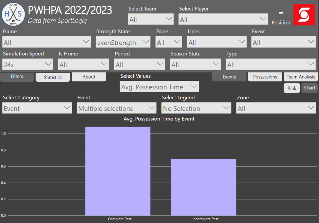
In the theory section we talked about not just play execution, but also play quickness. This is what we will look at now.
Here’s the average possession time leading up to completed passes and incomplete passes respectively. From this it’s very clear that quick passes have a much higher probability of failing. If the defensive team can force the puck carrier to make a quick play, then a turnover is more likely.
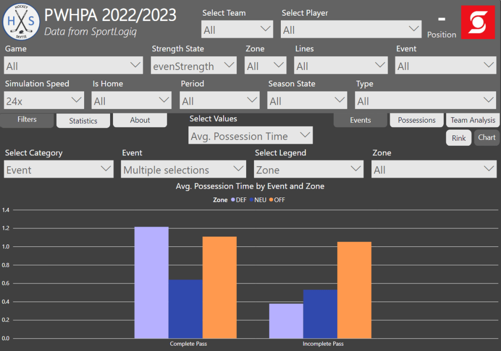
If we zoom in on passing times based on zone, then we see something interesting – The possession time of incomplete passes is only short in the defensive zone.
Here’s my interpretation: In the defensive zone, the incomplete passes are a result of an aggressive forecheck that forces the puck carrier to make quick decisions. In the offensive zone, the incomplete passes are more likely a result of making the difficult passes – going for the red pass.
Let’s turn our attention to the shot attempts. Below is the average shot time based on outcome. It should come as no surprise that goals have the lowest shot time – If you get the shot off quickly you give the goaltender less time to react.
The second lowest shot time come on missed shots. If you’re hurried in your shot execution, you’re more likely to miss the net. Blocked shots and shots on net have the highest shot time. If you’re slow in your shot execution, then you give the defenders more time to get in the shooting lane, but if you do get it past the defender then you’re more likely to hit the net.

The next chart shows the shot time based on shot type. There are no surprises here – Slap shots and snap shots are the go-to choice when shooting one timers.

The next chart shows the number of goals and expected goals based on shot time. Most goals and xG are generated when the shot is taken within the first half second.
It appears that Sportlogiq’s xG model is pretty well calibrated when it comes to shot time. If anything you could argue that the xG model overestimate one timers slightly.

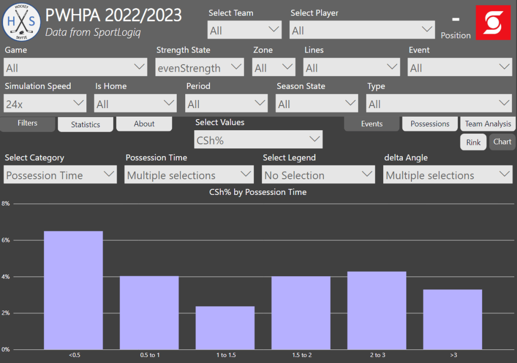
We could also look at CSh% (corsi shooting percentage), which is equal to the number of goals per shot attempt… So, it’s basically a measure of how often a shot attempt goes in.
If the shot time is less than half a second it has a greater chance of going in, but after that there’s no real difference. I would have expected the effect to wear off a little bit slower, but it would appear that half a second is enough time for the goaltender to get square.
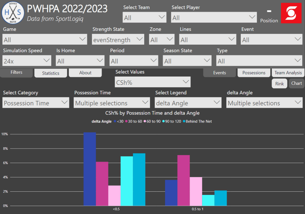
Lastly, we will look at angle changes and how that affects the shot probability. I’ve defined delta angle (angle change) like this.
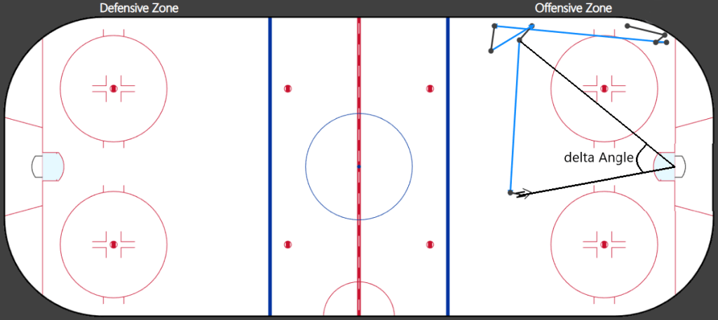
The chart below shows all the even strength shot attempts where a pass took place within one second of the shot. The expectation is that an angle change is very important on one timers… But weirdly enough we don’t see any clear evidence of such a thing. It seems like shot time is the most important factor, while angle change plays a much smaller role – Maybe the goaltenders read the play so well that cross ice passing is of less importance than I thought.
Also, be aware of the sample size here. We’re only including shot attempts taken within one second of a pass and the dataset is just 40 games. However, I’m still very surprised by the results. I was expecting a clear correlation between angle change and shot probability.
This was an example of how you can use the chart visuals to find leaguewide trends. Here we focused on possession time, but you could use the visual to look at pretty much anything. This was just the tip of the iceberg. If you know what you’re looking for, you should be able to make some very interesting findings with this tool.
The Team Analysis Visual
The final visual in this project is the Team Analysis Visual. In many ways, it’s similar to the chart visuals, but here the focus is on the four teams. The primary category is always the teams, but then you can select a secondary drill down category.
The chart below simply shows all the even strength events for and against for each team.

You can use the drill down function to get event details for a specific team. Here it’s event counts for and against for team Adidas.

The next chart shows the total even strength possession time (in seconds) for the four teams. Team Adidas possessed the puck more than their opponents, while Team Sonnet possessed the puck less than their opponents.
You can use the drill down function by right-clicking.
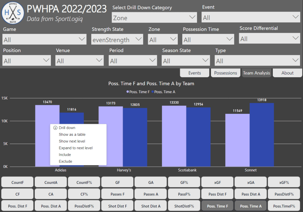
And here’s the drill downed Zone data for Team Adidas. We see here that most of the possession time advantage comes from possessing the puck in the defensive zone.
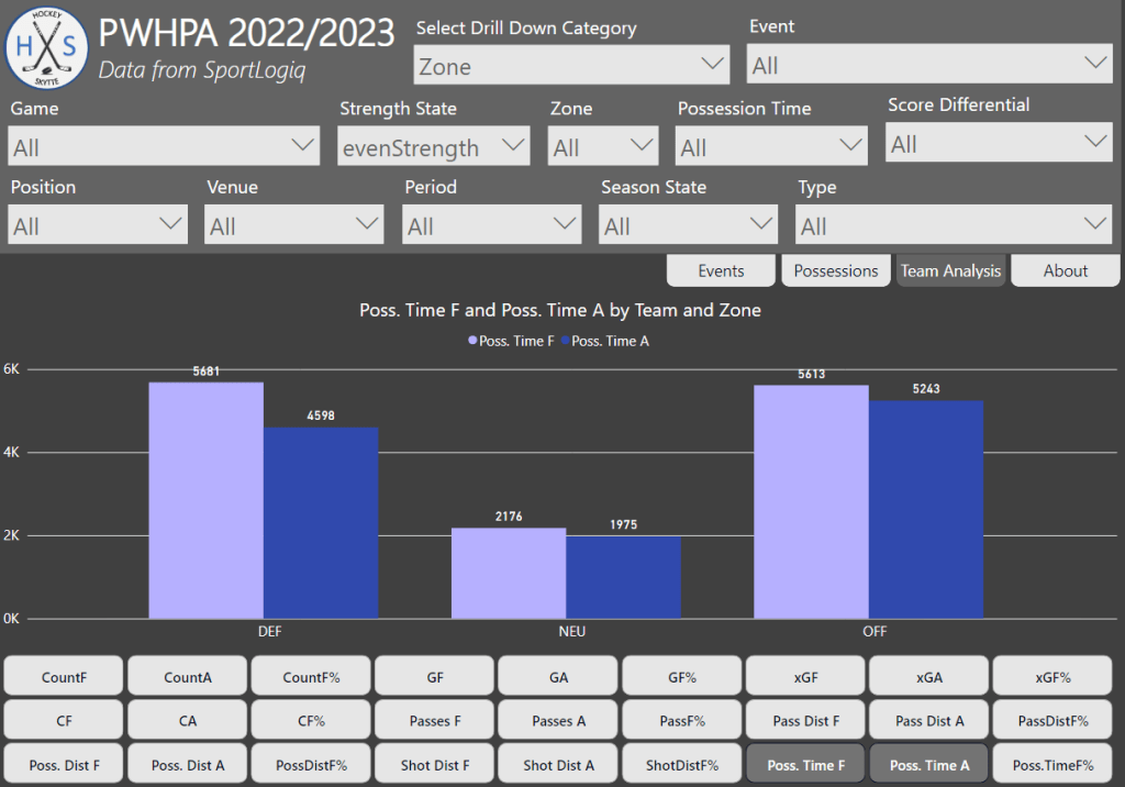
In the public hockey analytics sphere we’re not used to having access to actual possession numbers, so it’s common practice to use corsi as a proxy for possession. This is why I’ve chosen the last chart to compare CF% to Poss.TimeF%.

Conclusion
The main goal of this project was to create a tool to visualize and interpret Sportlogiq data. That is why most of the text above is just descriptions of how to use visualizations – That is the project!
I think I’ve managed to build a tool that both the coaching staff and the analytics team can use to find insights on the teams, the players and the league as a whole. It’s not my goal to guide the user in any particular direction. It’s up to the you to define your own questions and search terms. Then hopefully this tool can help you find the answers.
There were some interesting findings in regard to the possession time analysis. It would of course have been nice to have access to a larger dataset. Since I don’t I’m not going to conclude anything definitively. Nonetheless, here are some of the findings that I thought were fascinating:
- Incomplete passes in the defensive zone have a significantly shorter possession time than incomplete passes in the offensive zone.
- Shooting quickly will increase the goal probability, but the effect seems to wear off after just half a second.
- There doesn’t appear to be any clear evidence that angle change have a major impact on goal probability.
Perspectives
This project was about visualizing Sportlogiq’s data, and there are many other ways you can do that. Here’s a few things you could work on in the future:
- Goaltender visual with shot aim – Goaltenders and goaltender coaches could benefit from a visual that includes Shot Aim.
- Game Simulation – The game simulation part of this project definitely needs some improvements.
- Player cards – It would be obvious to focus more on the individual player. Perhaps looking in to player types (e.g. shooter, playmaker, puck carrier).
- Creating heat maps – Instead of plotting events and possessions on a rink you could use heat maps. For instance, you could map out possession times – this should give you some insights into the positioning of the players. Alternatively, you could create a heat map based on defensively plays only – this should give you insights on the defensive positioning. Of course, tracking data would allow you to make much better heat maps.
The spirit of this project is to not be too specific in the viz building. The goal is to create visuals with very few constraints.
Credits
The amazing Sportlogiq data was released for the Viz Launchpad competition at the 2023 Women’s Hockey Analytics Conference (WHKYHAC).
Also credit to James Dales and Icon Map for the custom visual used to build the rink visuals.
Thanks to everyone that gave feedback in the writing process, and finally thanks to the organisers at LINHAC for allowing me to present.
Contact
Feel free to reach out if you have questions, comments or in the odd chance you’re interested in hiring me for a project.
E-mail: hockeystatistics.com@gmail.com
Twitter: https://twitter.com/HockeySkytte
Donation: https://hockey-statistics.com/support/
