
In the coming days and weeks, I hope to add new features/visualizations to the Statistics Tab. The new profile visualization can be found by clicking on Player Statistics 23/24.
If you enjoy my work and wish support my continued work you can either donate a small amount below or Subscribe to my website (10$ annually).
Make a one-time donation
Make a monthly donation
Make a yearly donation
Choose an amount
Or enter a custom amount
Your contribution is much appreciated.
Your contribution is appreciated.
Your contribution is appreciated.
DonateDonate monthlyDonate yearlyHow the Visualization was built:
The visualization is built solely on the data file that you can find in the Data Tab. So, you should theoretically be able to recreate the visualization yourself.
I have linked the Line_Data and Shot_Data, which allows the user to see results with a specific forward line or defensive pairing on the ice. I don’t think this is an option on any other statistics sites.
The visualization is built using Power BI, which has its strengths and weaknesses… It’s a free tool and if you’re comfortable working with Excel it’s at least somewhat intuitive.
Let me know if you’re interested in doing hockey analytics using Power BI. I will gladly help you get started – Very few people that I know of use Power BI for Sports analytics.
How to Interpret the Visualization:
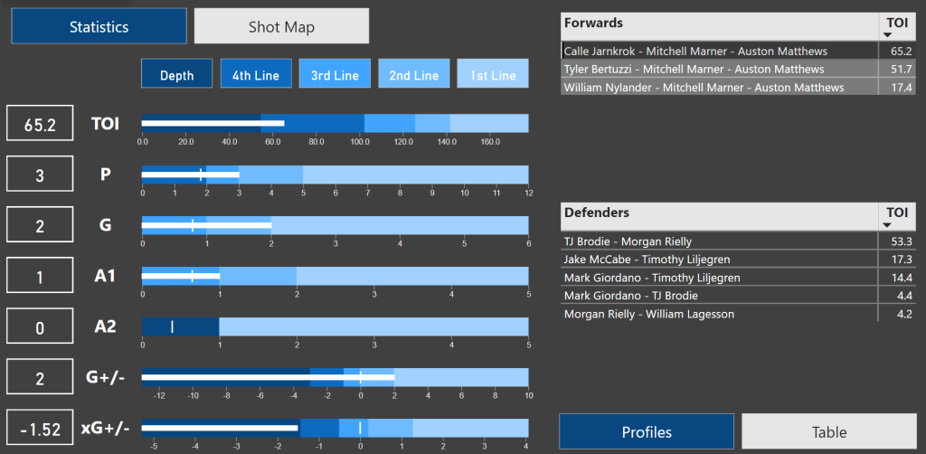
Let’s quickly go through the visualization step by step. In the top bar you can select the player and filter the data based on strength state and date:

Then you will see the statistics for the player in the following categories: Time On Ice, Points, Goals, Primary Assists, Secondary Assists, On-Ice Goal differential and On-Ice Expected Goal differential.

The scale in the charts always spans from worst in the league to best in the league – E.g., the league leader has 12 5v5 points.
The line/pair tiers are simply defined like this:
- 1st Line: The top 96 forwards in the league – This means that 96th ranked forward has 5 points.
- 2nd Line: From the 97th ranked forward to the 192nd ranked forward.
- And so on…
The little vertical white line indicates the league average based on ice time. E.g., a league average forward is expected to have just under 1 secondary assist per 161.4 minutes of 5v5 ice time.
To the right you can see the most common forward lines and defensive pairings when Auston Matthews is on the ice at 5v5. If you select a specific line it will show the results and expected average based on the selection.
If we select Calle Jarnkork – Mitch Marner – Auston Matthews, we see that Matthews has 3 points in that situation.
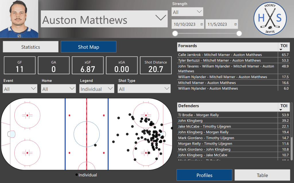
Finally, you can also look at Shot maps. The shot maps can also be filtered by forward line or defensive pairing.
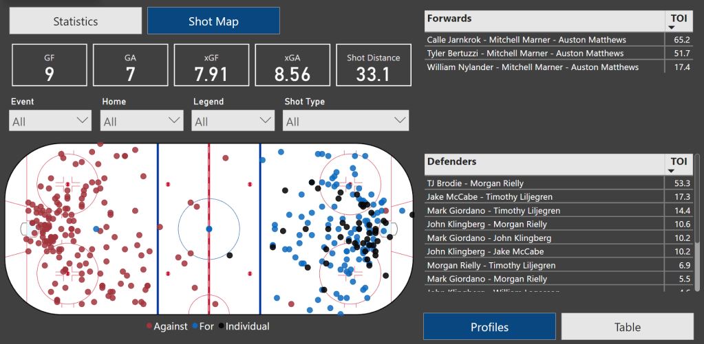
You can filter the shot map by Event (goal, shot, miss or block), venue (home or away), legend (on-ice for, on-ice or individual shots) and shot type.
In this case the shot map shows all individual shots by Auston Matthews at All strengths.
I hope all of this made sense, and that you will enjoy the visual. Let me know what you think.
What’s to come in the near future:
In the very near future, I hope to add some team charts and goaltender statistics.
In a slightly longer timeframe, I plan to move more and more away from Twitter. I don’t think Twitter is what it once was. So, I will start posting more things directly on my website instead of posting them on Twitter.
I may as well try to generate some traffic to my website.
